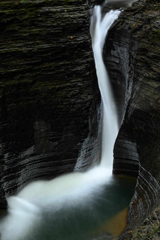
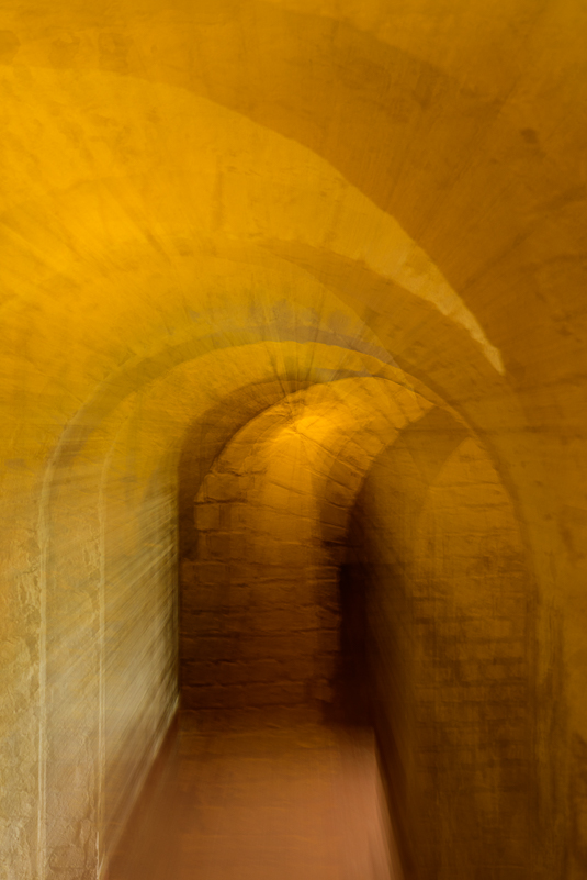
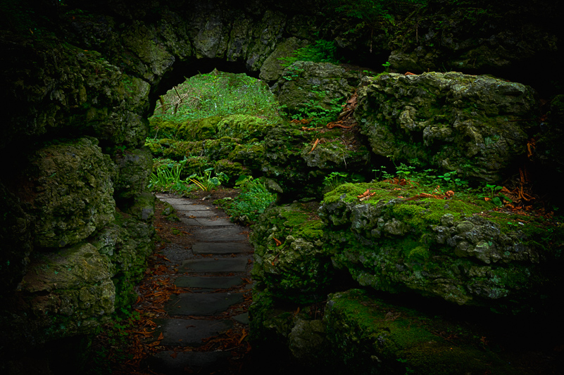
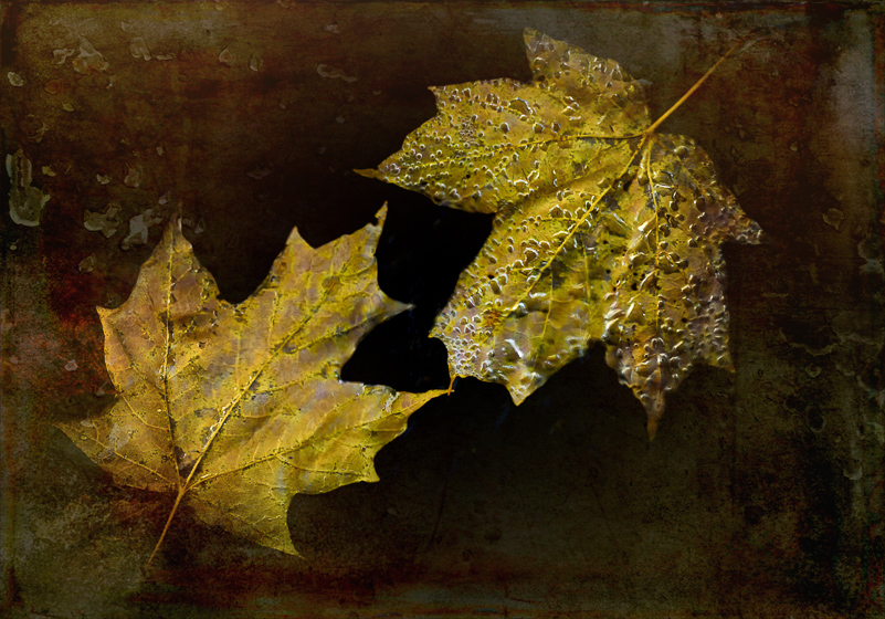
Line is a rich metaphor for the artist. It denotes not only boundary, edge or contour, but is an agent for location, energy, and growth. It is literally movement and change – life itself.
–Lance Esplund
AT THE BEGINNING IS A DOT
We live in a world filled with lines – defined, implied and metaphorical. We draw lines in the sand, color within the lines, stand on lines, create boundaries with lines and even use lines for writing. We find lines in music, poetry, fabric, work, roads, architecture and, especially, in nature. Without lines, we would have no shapes or forms or outlines of shapes. Lines have quality (thick, thin), create contours and even have textures (smooth, rough). They are a basic building block in art.
In geometry, there are four main types of lines – horizontal, vertical, parallel and perpendicular. Lines are described in many different ways – straight, wavy, curved, dotted, broken, zig zag, diagonal, and so on. There is no shortage of lines in our visual world. One person described line in the simplest form as “a moving dot.”
LINES AND DESIGN IN PHOTOGRAPHY
In photography and art, lines are used in many ways to lead the viewer’s eye, to create mood, tension and visual impact. Lines imply direction and movement. With this one design element, we can create stronger compositions with increased awareness of it in our scenes and subjects. We can use it to create or convey symmetry, asymmetry and balance as well. With line, we can create paths and define shapes.
Within photography we generally refer to seven types of lines in our images: vertical, horizontal, diagonal/oblique, leading, implied, converging and curved. These lines can suggest movement, direction, pattern, rhythm, distance, contrast, shape and more. We use our lines to lead, direct, show and tell the viewer what we want them to see and respond to. How we use line in our images varies according to our subject and what we want to communicate. Sometimes, our subject is line itself.
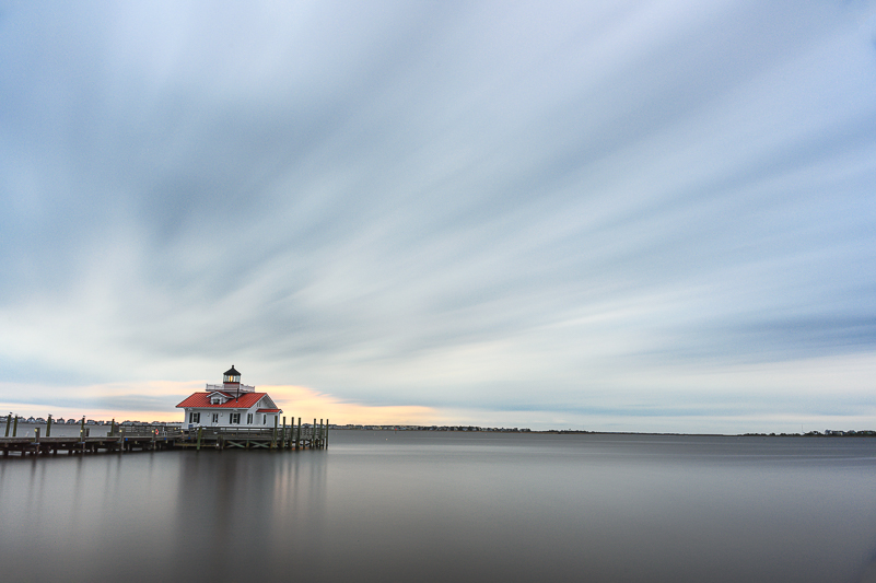
While line types may seem simple and obvious, they can express subjects and scenes differently. Vertical lines are ones that travel up and down. They can suggest growth and strength. They can also serve as a force to make us look up or stop, interrupting our typical left-to-right scan of an image. Horizontal lines run left to right, parallel to the ground or bottom of the frame. In the same way that a horizontal image does, horizontal lines can communicate restfulness or stability. In landscape photography, it is important that the horizon line is level, regardless of how much or little of it is included in the frame.
When we talk about diagonal lines, we should know that, technically, they connect at opposite corners of the frame. We often refer to lines that are not vertical or horizontal as diagonal. In reality, the angled lines in a frame that do not run from corner to corner are oblique. They are slanted, tilted or sloped at any other angle than right (90 degrees) between two perpendicular lines. Diagonal lines are oblique, but not all oblique lines are diagonals. Consider the consequences if the Leaning Tower of Pisa were leaning at a 45-degree angle … (What I have learned in reviewing many of my images is that I use oblique lines all the time, but have yet to find an image composed using diagonal lines.)
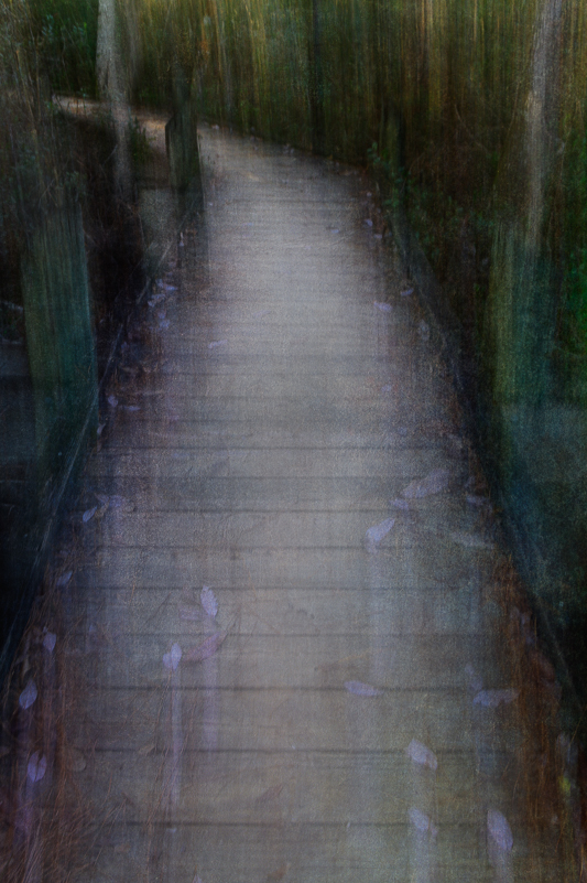
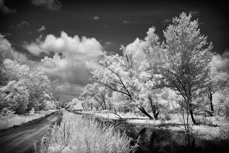
Leading lines are used most often in photography to lead the viewer’s eye through an image to a focal point. They add depth and dimension. They create paths in an image and are not necessarily straight or curved. You can also have several leading lines in an image. Any of the other line types discussed can be, and often are, used as leading lines.
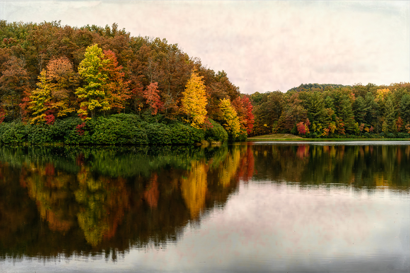
Implied lines are typically made up of similar subjects, objects or shapes (trees, people, buildings, etc.) that create visual lines. Consider flower petals creating lines in a macro image, or clouds in a landscape, waves in the ocean. There are also implied lines in the movement or gaze of a subject that suggest line and direction. Think of a bird in flight or a person looking toward something not included in the frame as examples.
Converging lines involve two or more diagonal/oblique lines moving closer together from foreground to the background. You can see this with roads, buildings, rows of crops and much more. This type of line is also used in portraiture to lead the viewer to the person or people in the image. The more you look for converging lines, the more you will find them.
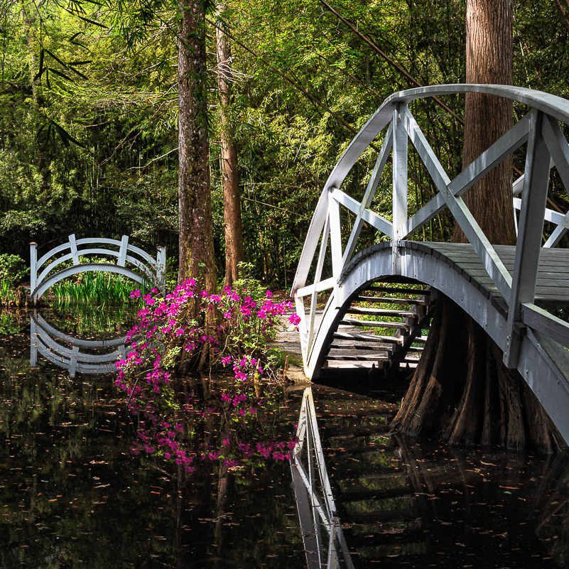
Finally, curved lines are ones that are simply not straight. They meander and slow down the viewing path, suggest movement and can be more restful in nature. The most commonly used curved lines are the “S-curve,” followed by the “C-curve.” The S-curve creates flow and graceful movements and serves to guide the viewer. It helps to make an image more dynamic and is often called the “curve of beauty.” The C-curve is relatively simple and is more of an arc. We see this curve used in bridges and architecture quite often. Curved lines can represent comfort and ease or calmness. We also see spiral curves, especially in nature. The Fibonacci and Golden Spirals appear in nature, but not every spiral in nature is related to the Fibonacci numbers. The spiral is one of nature’s most common configurations (think snail shells, sunflower centers, pine cones, and other flowers, for starters). These curves create interest in their patterns and visual movement.
LINES, CURVES AND SHAPES
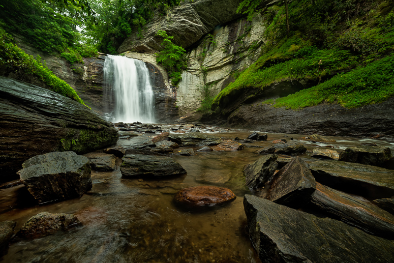
Lines and curves also play a role in creating shapes, whether in the literal or perceived sense. Consider how landscapes are composed of rectangles, triangles and even semi-circles or other shapes. These shapes have their beginnings in line. How we arrange these shapes can change the energy within a composition. Recognizing patterns of line and shape can help us build stronger compositions when we become aware of them. Other elements of design (color, texture, form, space, pattern and light) all work together to help us create images that are visually appealing or impactful. It is a dance of balance and dominance that guides the viewer when we decide which element has the most influence in any given image.
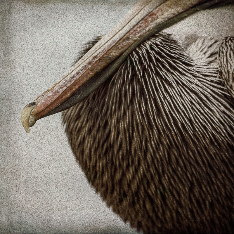
Our role as the photographer is not to confuse the viewer. Rather, it is to create a semblance of order out of chaos. We do this by identifying our subject, removing distractions and by making use of compositional elements and techniques to let the viewer discover and know the what and why of any given image. It’s not a guessing game, though mystery can be part of the mood we might want to create. Some images are all about the lines, where a line or lines dominate and are the subject. In this case, the lines are even more important than the actual object making the lines. Other times, and more often, the lines are what we use as the guiding element that we incorporate to express the scene, subject and mood.
AN EXERCISE TO CONSIDER
As I was writing this, I thought of an interesting exercise, Peruse your images. Observe how you use line or other design elements, and how often. Then, evaluate how those choices relate to the elements and whether they strengthen or weaken any set of images or individual frames. To add to this process, select one element to practice. How about starting with line? Work on seeing and using line in your images to enhance your “muscle memory.” It doesn’t have to be a project, per se, just an outing or session where line is your primary focus in every image you create during that time frame. Then, review the images and evaluate which images are stronger because of how you chose to incorporate the use of line. (In selecting images for this post, I learned that curved and oblique lines are dominant in many of my images.) This exercise or challenge could be used to practice any of the elements of design and composition. While we are at it, how about exploring the work of other photographers and artists. Observe and learn how they make use of design elements, regardless of their subjects. I’m thinking that my next challenge will be to focus on the use of space or negative space. After that, perhaps, it will be pattern, then texture, and so on.
PRACTICE, PREPARATION AND PLAY
My experience has shown that practicing anything when it doesn’t really matter prepares me for when it does … When we travel long or short distances for photography, we want to bring home images that don’t require reconstruction. The practice that we do locally to keep greasing the wheels of creativity, composition and connection serves us well. We need to put our noticers on and be intentional. Experimentation and play are not ruled out, ever. It pays to practice, to be prepared and to be open to learning and seeing new things. It helps when we step back to dig into what may seem like the basics. We never know what new ideas going back to the basics might lead us toward.
With that, it sounds like I’ve given myself an assignment. How about you?


