I have always stood in awe of the camera. I recognize it for the instrument it is,
part Stradivarius, part scalpel.
– Irving Penn
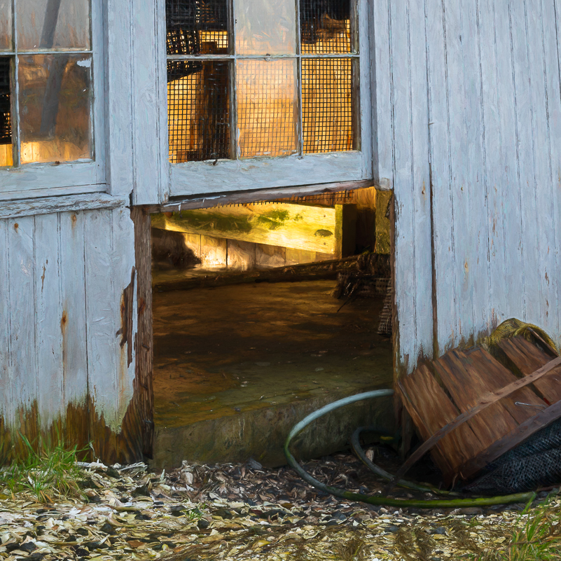
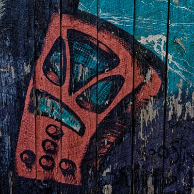
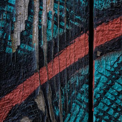
THE SQUARE ASSIGNMENT – MAKE IT FIT
Many of you know that I am fond of giving myself challenges. It’s a great way for me to shift my thinking in general and my perspectives in shooting. As I thought about something I hadn’t done before, I considered the square. My mind travelled in many different directions relating to the concept and perceptions of the simple geometric shape made up of four equal sides – no side more dominant or directional than the other. The square might get a bad rap on several levels. It’s a box and not the normal one we work with in photography. At first glance, the first question one might ask is, “how do I fit or cram everything into “a box” with such limitations. What I know is that this is the wrong question. So, exploring the square became my focus.
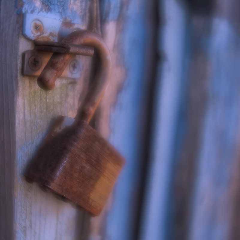
This assignment made me look at some of my favorite subjects in a different way. It made me think – creatively, metaphorically and technically. To keep me on task, I simply changed the image area aspect ratio in my camera to 1:1 and then composed and shot the box. I forced myself to stay with it about 98% of the time. I didn’t want to fall into the “I’ll crop it later” mentality, which for me is often associated with laziness and a bit of sloppy thinking and shooting. It’s not that I don’t crop because I do. It’s more about staying tight and thinking about what I want in the image, not what I can fix later with a crop. It’s an exercise in discipline – the kind I used during the years when I was shooting slide film. For those who remember, especially when shooting slides, you either got it “right” in the field or you tossed the slide(s), your time and money in the trash.
One of the advantages of digital photography is that we have the freedom to experiment and do things we might not have tried with film because it would cost money and we had to wait for the results, good or bad. One of the disadvantages of digital is that our attitude, behavior, discipline and focus can shift into the messy zone because “pixels are free.” It’s a multi-faceted proposition that requires a balance of freedom and discipline that encourages creativity, risk, play and exploration. It allows us to win the battle of the judges and fear of failure or not conforming without sacrificing quality in the process. I’m okay with things not working out; it happens. I’m not okay with not trying.
However, I know when I’ve been playing loose and messy, and it shows. I can see it, and want to kick myself in the butt. That recognition brings me back to paying attention to my “intention” and to a place where I can play with both openness and purpose.
WHAT WAS IT ABOUT THE SQUARE PHOTO?
I entered the photography world in my early 30s, and my first “real” camera was a 35mm SLR. I have only shot a few rolls of black/white film and have been in the darkroom twice in over two decades. I don’t have a long history with photography as it relates to working in monochrome or the darkroom, and I have never shot portraits or people except on a casual basis. My focus when I started shooting was to learn how to make the camera work for me, learn the basics of photography and become a better photographer. Becoming steeped in photographic history was not at the top of my list, the exposure triangle was. I loved working with film, but it was always about the viewfinder and the print.
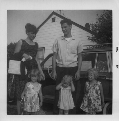
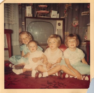
I began wondering about the roots of the square photo after having had a ton of old family photos scanned. I noticed lots of squares. Most of the photos were taken by my grandmother, and others were passed down from her. She wasn’t the best technician, but she loved taking pictures, our family pictures; and because of her, we have many memories preserved in black and white and color that help us remember what we were like growing up and what the times were like. Even the photos of people I don’t know (not a clue) tell the story of life through my grandmother’s eyes and mind. For that I’m thankful and wish I had appreciated those “stand here and smile” moments just a little more. And this is part of the reason for this blog on the square. I also needed a challenge, something to get me shooting and thinking and creating.
SOME HISTORY ON THE SQUARE FORMAT
Some of you may know this, especially those with a long history in film photography (not saying you’re old, but you’ve seen many things). The origin of the square photo has its roots with the original Rollei, a 6×6 camera released in January 1929. It was made for 117 (B1) film, gave the photographer six (yes, six) frames and a choice of two lenses. It was followed by the Rolleiflex Standard (TLR). I looked it up – TLR stands for twin lens reflex. The camera had two lenses of equal focal length – one for viewing and focusing and one for taking the photo.
In 1948, after WWII ended, Victor Hasselblad from Gothenburg, Sweden rolled out the square format Hasselblad 1600F, a single-lens mirror reflex, 6×6 camera with interchangeable Kodak lenses, film magazines and viewfinders. It was the first consumer camera and was unveiled in October 1948 in New York City. If you were a professional photographer (or even if not), you likely owned a square-format film camera. The Hasselblad 500C was launched in 1957 and was one of the most iconic cameras in photographic history. It was used by legends such as Ansel Adams, Richard Avedon, Irving Penn and Diane Arbus.
Many photographers embraced the square in uniquely different ways from fashion to portraits and nudes to still life and flowers and in the cultural and celebrity world. The 500C was the first camera to “properly document space” in 1962 by astronaut Walter Shirra on the Mercury rocket. Suffice to say that the square format photo has a long and storied history. The final model, 503CWD, was released in 2006 in commemoration of Victor Hasselblad’s 100th birthday and had a digital back.
And while Rollei and Hasselblad were pioneers, we cannot forget that there were and are other square options – Yashica-Mat, Mamiya, Bronica, Holga, Lomo and even Polaroid. These days, while we do crop and print to square, our “standard” box is the rectangle. That is the box we most often work to fill.
THE MODERN SQUARE
Remember when Instagram started in 2010? Much to the chagrin of many, it allowed only square-format images. There were arguments against the limitation of the square, and people found ways around it. For five years, Instagram held its ground. Good for them. In many ways there was value in requiring that users “conform” to the forced aspect ratio of the square. Equal time and space for every image in the box and the scroll, as well as lessons in following rules or guidelines. What a concept. This meant that everyone got an opportunity to flex their creative muscles in what might have been an uncomfortable and different way.
I will admit that I wasn’t a fan at first. I mean, for starters, I had never really considered the square and still have issues with the “standard” 8×10 mentality. I don’t always crop to a standard aspect ratio, especially if it won’t “work” for the image I have in mind. The way I see it, I work hard to include only what matters to me in the image. I refuse to compose or crop to fit a frame that doesn’t work for my vision. In 2015, Instagram yielded. We are no longer confined to square format. To be fair, I repeat, I think the square gets a bad rap. We should give it a chance.
LESSONS FROM THE SQUARE
So, how did this assignment play out? I must say that I learned a few things about the square that I otherwise would not have. Some lessons were obvious, others took more time and effort. Going back to geometry lessons – All squares are rectangles, but not all rectangles are squares. That means that trying to make a rectangle image work as a square one isn’t always possible. It’s about what “fits.” Let’s explore.
For starters, the square, like any other format offered in camera, is a forced ratio. This is true when using a square-format camera, but also when you set your camera to record images only as square – which I did, even when there were scenes that would work (or work better) in the “normal” 35mm rectangle. It is also true when you give yourself an assignment that means considering the square in general.
Then, how you “read” a square image is different from reading the rectangle. With the rectangular format, our eye typically reads side to side or up and down. With the square, our eye generally moves in a circular direction. We may start in the center of the image and move outward in a circular motion or start at a point and move around mostly in a clockwise direction. Knowing this changes how you might compose for impact. Where you place your subject may not follow the usual “rules.” Our eyes see in a more panoramic manner, although not everything within our field of vision is in clear focus. Consider our peripheral vision and how little on those edges we see clearly. The square makes use of the space and stuff that is directly in front of us and our camera.
Does this mean that the “rule of thirds” doesn’t work or that it has no place in the square? No, but it does release you from the obligation to try to make it work when it won’t. The square format gives you an opportunity to forget about that “rule.” Go ahead, dismiss it, kick it to the curb, if you like; but pay attention to how you choose to arrange within the space.
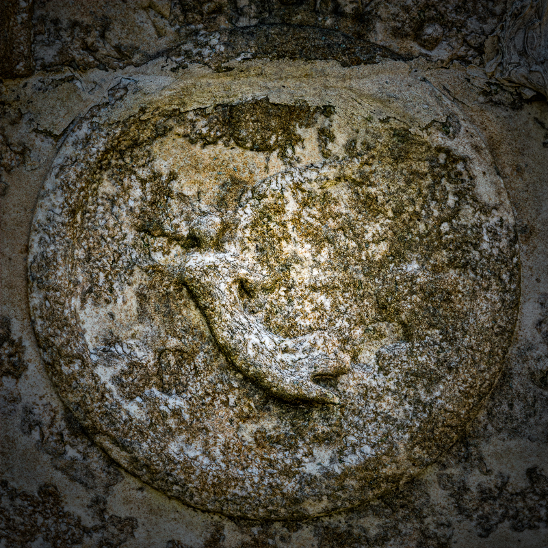
And, what about the “bullseye” – the centered subject? In the rectangle, a centered subject has a tendency to be boring and static. You’ve heard this before. When you center your subject, the viewer is stopped visually and doesn’t feel the need to explore the rest of the frame. The centered subject in a rectangle says, “Look here, no need to go anywhere else.” So, we don’t or shouldn’t do the bullseye without intention. Guess what? The square image is more forgiving of the “bullseye” composition. In fact, it can invite the centered subject, especially when your intention is to emphasize symmetry or some other quality relating to the subject (even stagnation or stuckness).
One thing I experienced in working with the square bullseye is that it’s not as easy as one would think to line everything up and achieve balance in the frame in camera. (See the headstone image. I had to work very hard to get that and was surprised by the challenge. Seems like It should have been a cakewalk. It wasn’t. As I was working several compositions, I felt and heard myself say, “it would be so much easier to crop this on the computer …” Shame on me.
And, then there’s this: the square format celebrates shapes, lines, texture and graphic design elements. Yes, it does. It embraces the use of negative space just as much as the rectangle. What you leave out of an image is still as important as what you leave in the box. Horizon placement, subject placement and frame division all play a part in establishing the mood and feel of the image – even with the square. The square can tend toward creating a sense of balance, stability and serenity, but there is plenty of room to create dynamic movement and tension.
Horizon placement still matters and makes a difference. I found this to be true with many of the landscapes I shot in square. It continues to impact the look and feel. Still, the impulse to fall back on the “old faithful” rectangle had its pull. I admit there were a few times during this assignment when I stepped out of character and left the square behind for a few frames. I couldn’t help myself (or chose not to). Yet, I always came back to conform to the square box for the exercise.
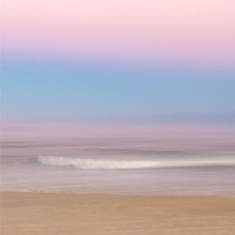
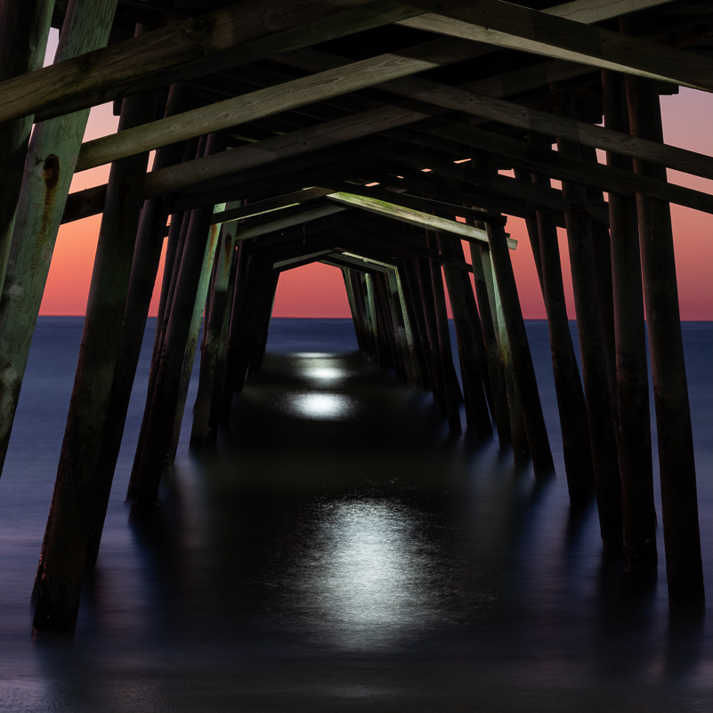
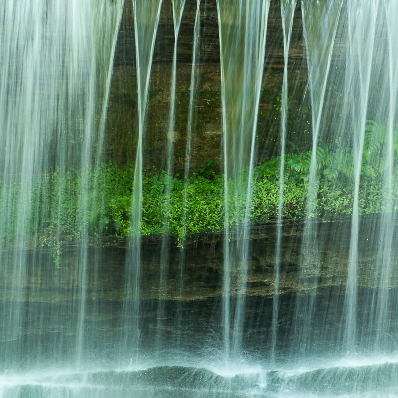
We may think, too, that the horizontal image is the best way to convey peace and serenity because of its restful orientation. Let’s not dismiss the square too quickly. I found that the square can be incredibly powerful in the peaceful zone. The technique of adding long exposures to a scene with moving elements (water, clouds, etc.) has a way of slowing down our mind as well. Long exposures invoke the element of simplicity that can often lean into the serene. Simple can be quiet. It can also be strong and powerful.
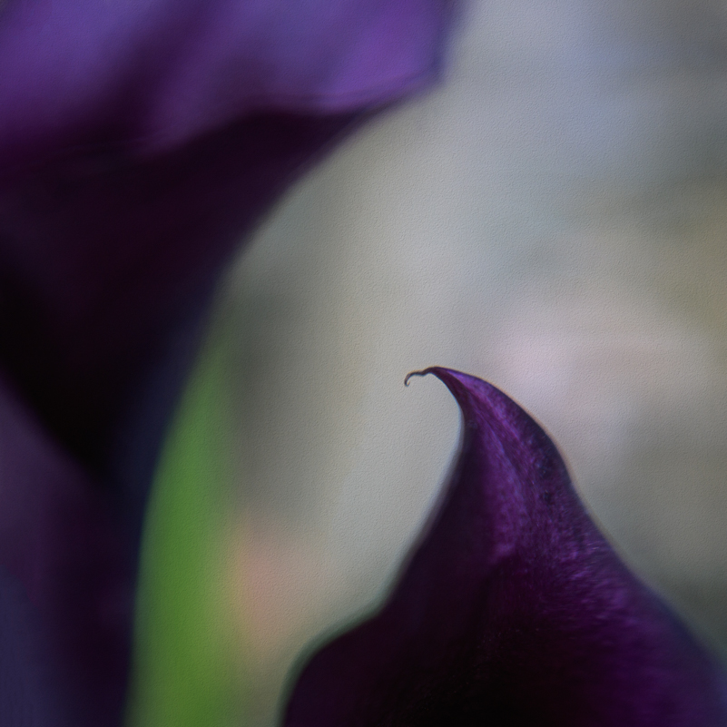
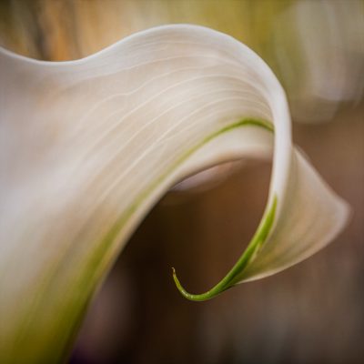
Negative space and the square can have an advantage. How do you use that empty space in an image that surrounds or envelops the subject? The idea is to create a relationship between what is and isn’t in the frame, and the empty areas can be powerful. There are times when the square has an advantage. There’s less space to work with. How you use the space can strengthen a composition by creating a mood and calling attention to shapes and details within the space. With a square, there is less potential for “extra” empty space that doesn’t add to the image. A stronger composition comes into being when the area is filled or left empty with intention. The choice is yours. I found this to be especially true as an interesting experiment with abstract images of the calla lily ensued. Add to that the choice of black/white for even more impact, and I was quite pleased.
WORKING THE SQUARE IN BLACK AND WHITE
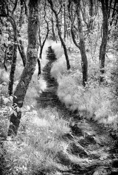
When we remove the color from any image, we’re left with the bones, the essence. The power of the image then resides in the tonal contrast and design elements such as line, shape, texture and use of negative space. Composition matters. This is true regardless of the format or aspect ratio. However, the square invites a paring down of elements and ideas. Moving an image into the monochrome zone removes what can sometimes be the distraction of color. Details are emphasized, contrast is elevated and simplified. And, as much as I love color, it sometimes gets in the way.
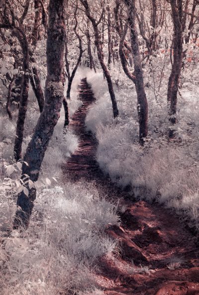
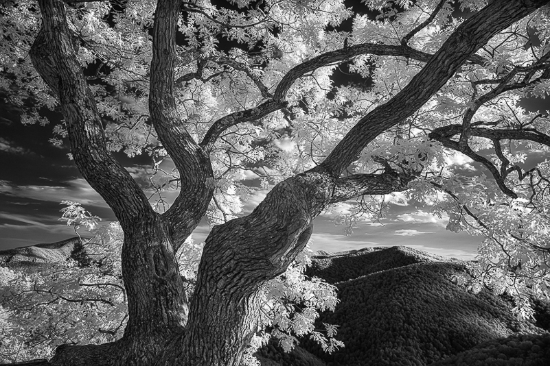
My experience with infrared photography helped me break away from the color world and “see” in monochrome. Before infrared, I couldn’t envision what a subject or composition would look like in black and white. Then came infrared. As I shot images at 590nm, what I saw on the back of my LCD reminded me of a negative, only better. That was when I began to see the “bones” of the black and white image even as I stood looking at the color scene. I could see the lines and shapes, the details and flow with better clarity. I began to “see” what would work well in a colorless image.
As I processed those infrared images first for faux color before moving them into the black and white zone, I saw the added value of infrared in my work – not just for a new genre, but for the hands-on education I got in the field and in post for the black & white world. One thing I learned and share is that, regardless of origin – color or infrared – processing the “root” image first and fully will give me a stronger black & white image. Going directly to the b/w conversion without that step yields a far less impactful image. We want to give the black/white software the most and best information to work with to create the image. My choice for this process has been and continues to be Nik Silver efex Pro.
Now, as I worked this assignment and reviewed the images, I could actually see which would be stronger in black and white AND square. In the end, it’s up to you and me as the photographer and visual artist to add to our toolkit whatever helps us see more and better. It is our vision that should lead the choices we make as to how our images are presented. Getting out of our comfort zone, learning new things and experimenting with abandon and commitment makes us grow. This assignment expanded my horizons with more knowledge, insight and practical experience.
FINAL WORDS ON THE SQUARE
In the home stretch of this exercise on square photography, I believe I will consider it more often than I have in the past. It encourages different thinking and seeing, changes my approach to composition, provides little opportunity for wasted space and pushes me to think graphically and consider black & white. It works well with a wide variety of subjects such as landscapes, portraits, nudes, still life, architecture, details & abstracts.
I learned a bit more about the history of photography and have an even greater appreciation for those who led the way even with what some might view as the limitations of film and formats. I learned more about other photographers whose work and names were less familiar to me, though perhaps they should not have been. And, in my research for this assignment, I “discovered” a photographer whose work I barely knew – Irving Penn. My interest is peaked, and I look forward to learning from and appreciating a different approach to flowers and still life and square and black/white, and so on. To that end, I have two books of his work on the way. We must never stop learning.
I will look back on some images in my files with the possibility of their being stronger as a square or simply different. Remember, I work to put in the rectangle what works best and am mostly happy with the results. There are times when I can’t get in the best position or can’t remove the things that don’t belong because I can’t walk on water. Go figure. Perhaps, in some of those instances, the square will be the better and stronger option. Perhaps not.
Being in the square zone can be “cool.” If you remember, in the mid-eighties there was a song, “Hip to Be Square” by Huey Lewis and the News. Being “square” is often interpreted as conforming, confining and sometimes boring. Being “hip” is the almost the opposite. The song itself was not intended to celebrate being square, but many interpreted it in that way. It played in my mind many times throughout this exercise … So, the question, “is it hip to be square?” I think so.
A PARTING CHALLENGE FOR YOU … GIVE THE SQUARE A CHANCE
If you’re inclined to step into the box, and you can do it, change the image area aspect ratio on your camera to 1:1 and leave it there for an entire day of shooting. If your camera won’t allow this option, shoot a stretch knowing that the objective is to crop every image to the square format. You’ll be surprised at what and how you will see. And, if you are able, resist the temptation to fall back to the comfortable rectangle – at least for that day.
Be strong, be open and creative. You can do this! You’ll be surprised at what you see and learn.
